Category: Case study

  • Book A Bar

    Book A Bar

    Book A Bar Ltd is a mobile bar company operating out of Maidstone, Kent. I met with their Director, Byron, in 2021 following a local advertisement for freelance design services. The nature of assistance that Book A Bar required at the time centred around maps for a handful of their event spaces in the July of their upcoming season.


    Initial Assessment

    On meeting with their team and shadowing their workflow during a week at their head office, I spied a range of assets that had been overlooked:

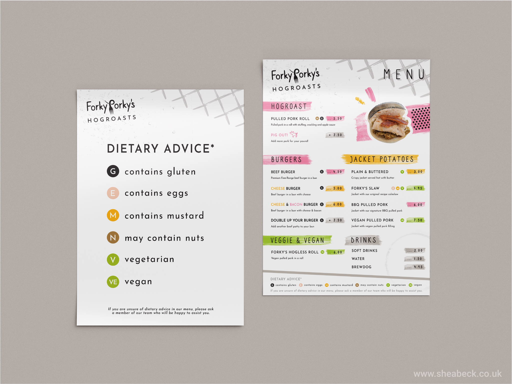
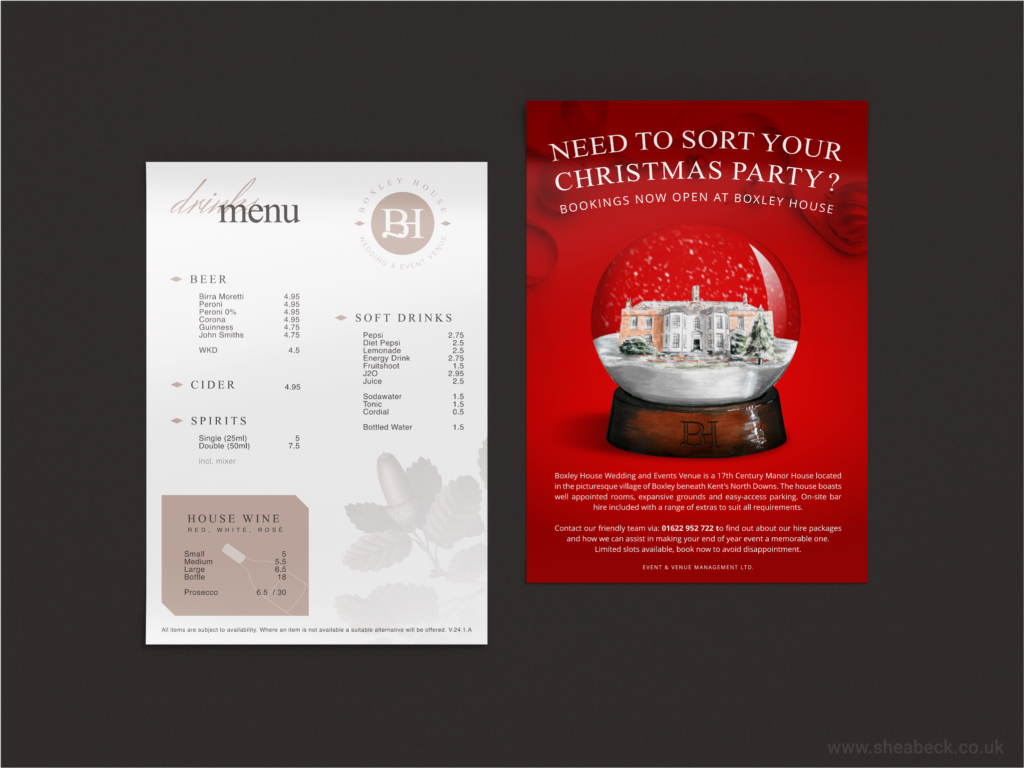
    • A selection of physical media, namely bar runners and menus, had the wrong typefaces that led to a lack of continuity on Book A Bar’s point of sale media; crucial for their customer experience.
    • Their existing promotional media had varied styling and it became clear that multiple designers had been employed to create one-off assets that didn’t tally up with their brand’s message.
    • Existing digital channels and their core website were outdated and left the customer overwhelmed with false information, this crossing of wires meant that Book A Bar’s sales team had to frequently readjust their customer’s expectations as the pricing their customers had found was incorrect at the time of their initial call.

    These issues caused the following difficulties for Book A Bar;

    • An impression of incompetence on the customer’s side as the information they discovered from the company’s official channels proved to be unreliable during first contact.
    • A level of frustration on the sales team as they would be chasing their tail asking for up-to-date information in-between calls with a potential lead; thus increasing conversion time offering up the opportunity to lose the customer in the interim.
    • A lack of cohesion felt by the customer across the Point of Sale and other channels – typefaces and logos being different to what was expected – and sales media existing in random styles made it hard to discern whether the media belonged to the company at first glance.

    The result of these issues hampered lead nurturing and called the company’s efficacy into question, a big problem for an independent business that was recovering from a period of inactivity (UK Lockdown) and couldn’t afford to miss opportunities in the already saturated hospitality sector.


    Future Brand Strategy

    On meeting Book A Bar, their Director had made it clear that brand standards were important to them and the relatively quick expansion of the company had resulted in a necessity to focus more on the operational side than their brand identity. This shift to the physical had worked incredibly well for their sales in the short term but, in a competitive market, the necessity to update and focus on a more encompassing strategy had become apparent. Book A Bar became intrigued into how they could improve their offering and limit damage to their future sales by investing capital into brand identity, and so Byron and I developed the following outline to assist in reigning in the ‘bolted horses’ and get a handle on what needed to change:

    Assess which materials were out of date > Listen to the Team’s concerns regarding their daily operations > Look through customer feedback to figure out where to position the branding going forward > Set an order of operations from Top Priority to Lowest Priority

    With the above outline in mind, we followed up an analysis of the brand with a clear direction for each segment and began refreshing the relevant media in order to improve the identity as a whole and patch up Book A Bar’s appearance.

    Timings of projects were relative to Book A Bar’s ongoing workload during the weekends (with setup for events occurring during the week) and so targets were approached incrementally so as not to disturb this workflow or interfere with the success of their team. The following was achieved over the span of 6 months:

    1. Remastering the logo materials which had since been split across an internal server and were no longer understood by the team. New iconography was also created at this stage and the core language of the brand established before proceeding.
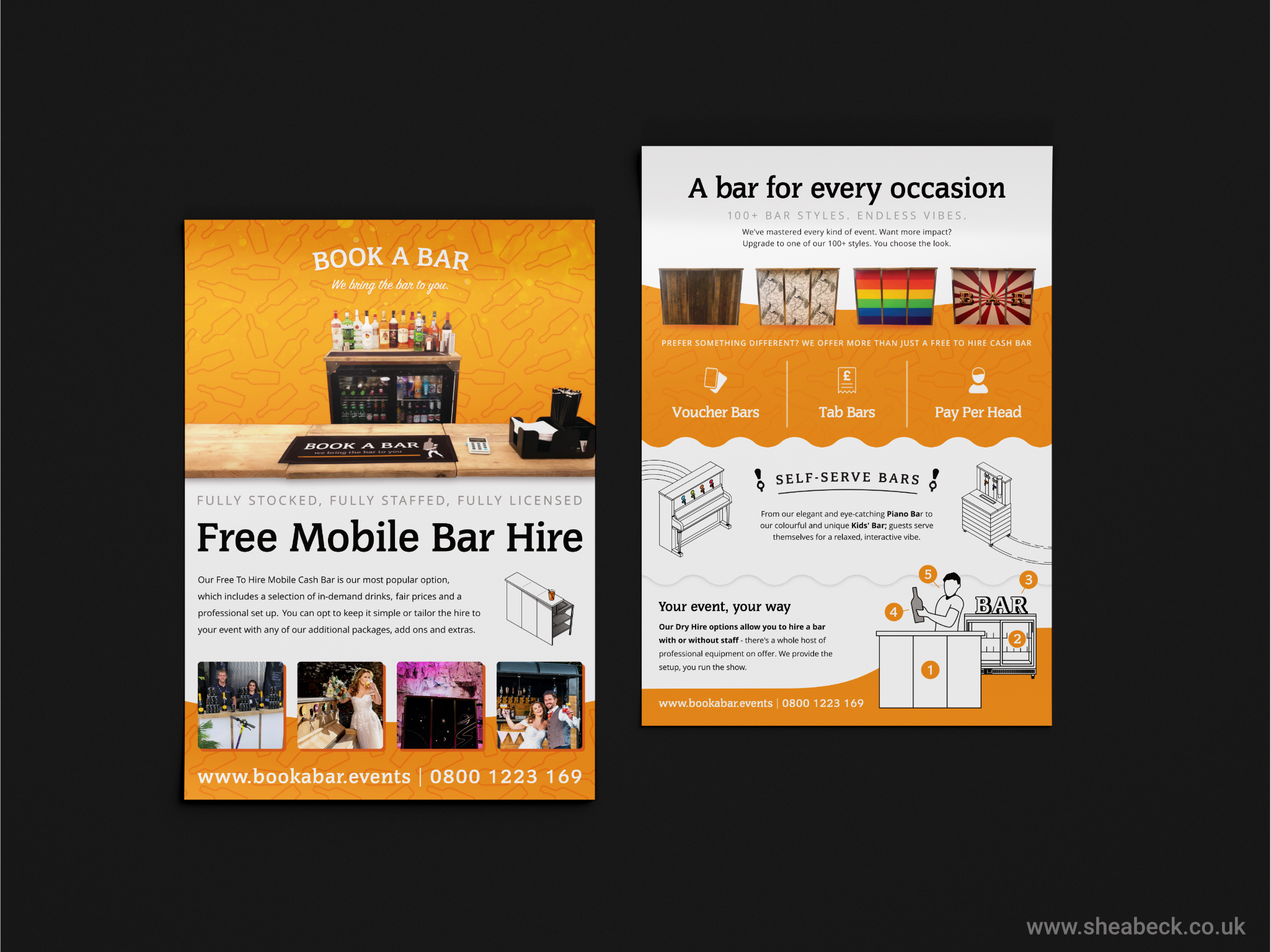
    2. Refitting the existing website and making sure all of the media contained therein was relevant, correct and easily accessible to potential customers. Highlighting key products and packages that could be upsold and creating curiosity for the client before their initial contact; phone or email.
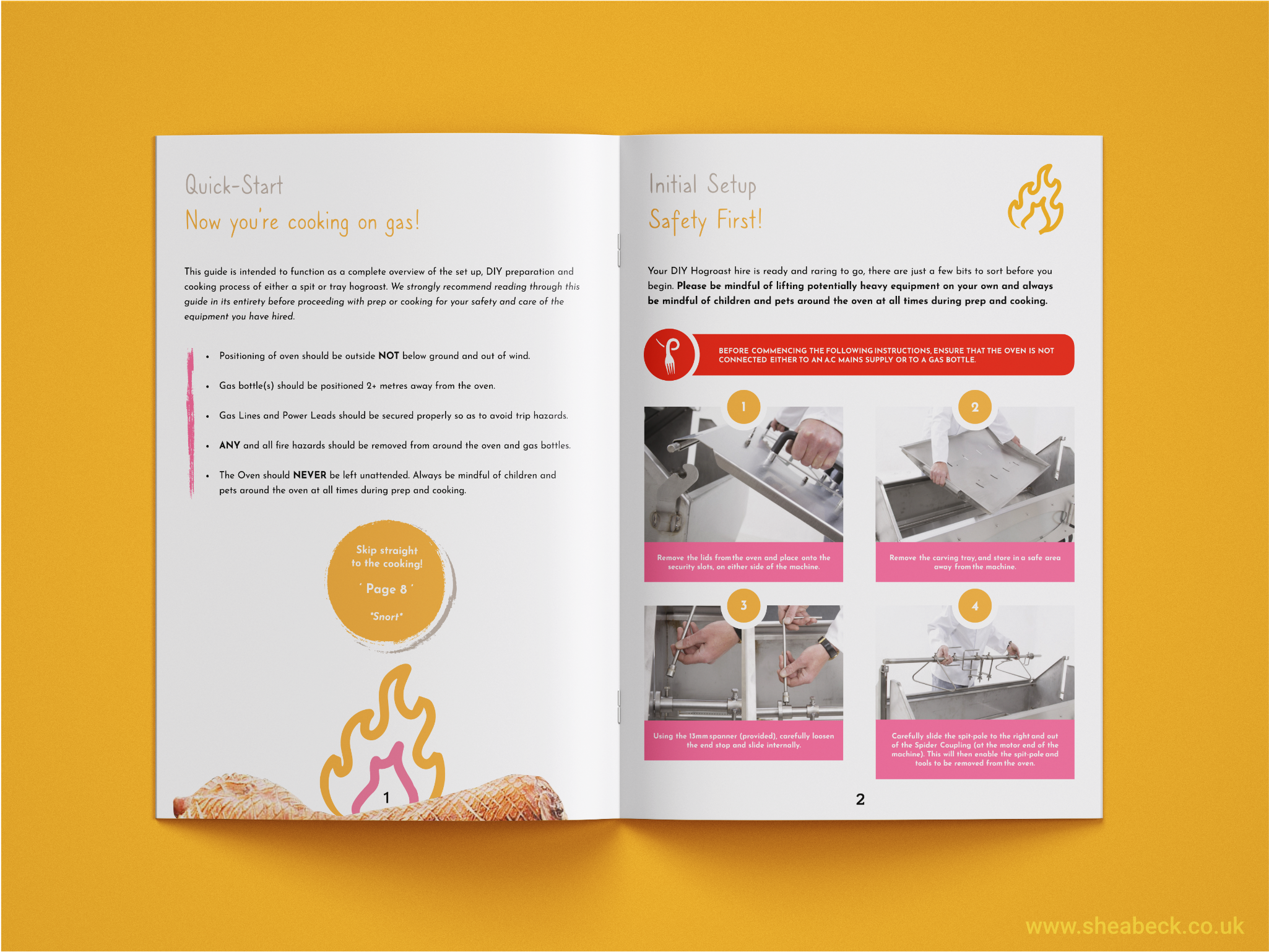
    3. Resetting the brand standard expectations for the immediate Team’s daily touchpoints: email templates that required modernising, letter headers for correspondence, quoting templates for customers, and labels that were used internally as well as on-site for equipment in the public eye.
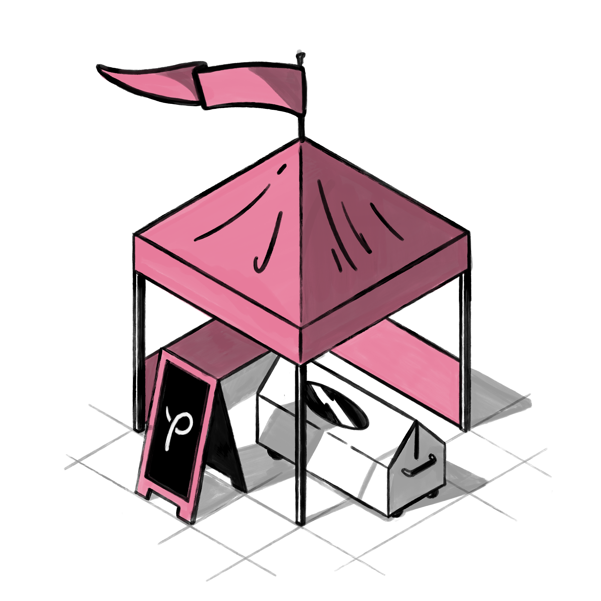
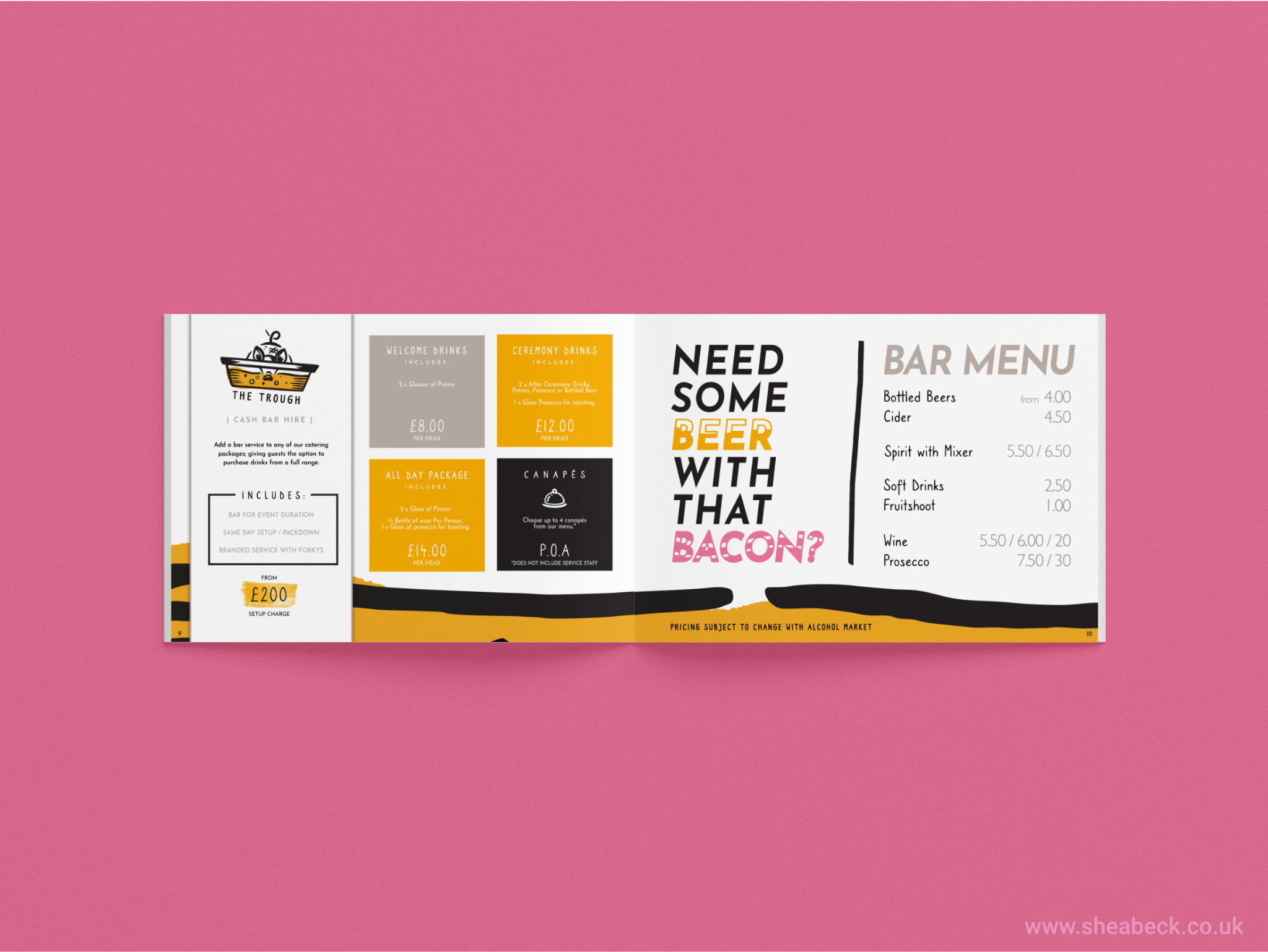
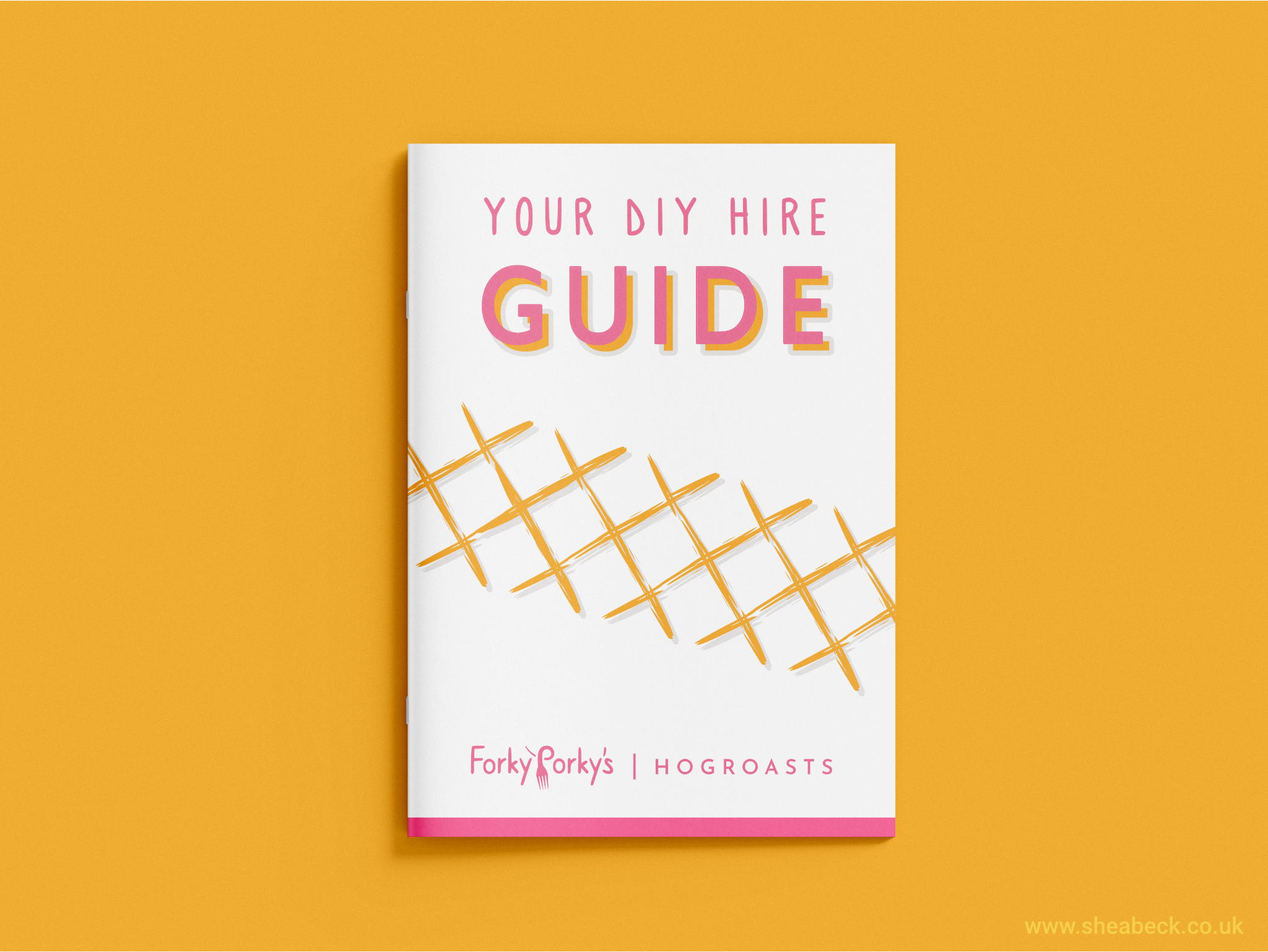
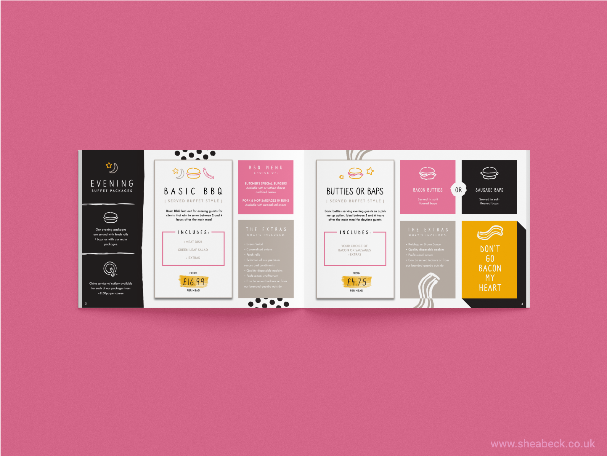
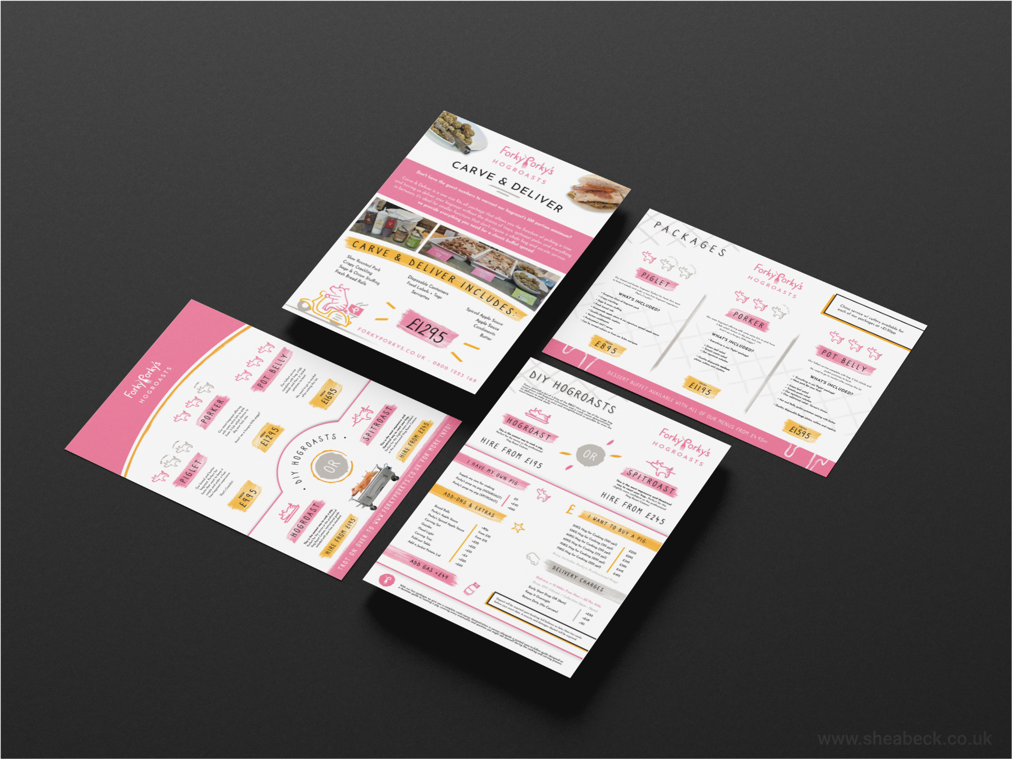
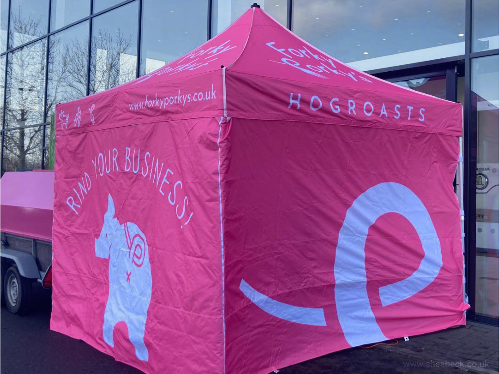
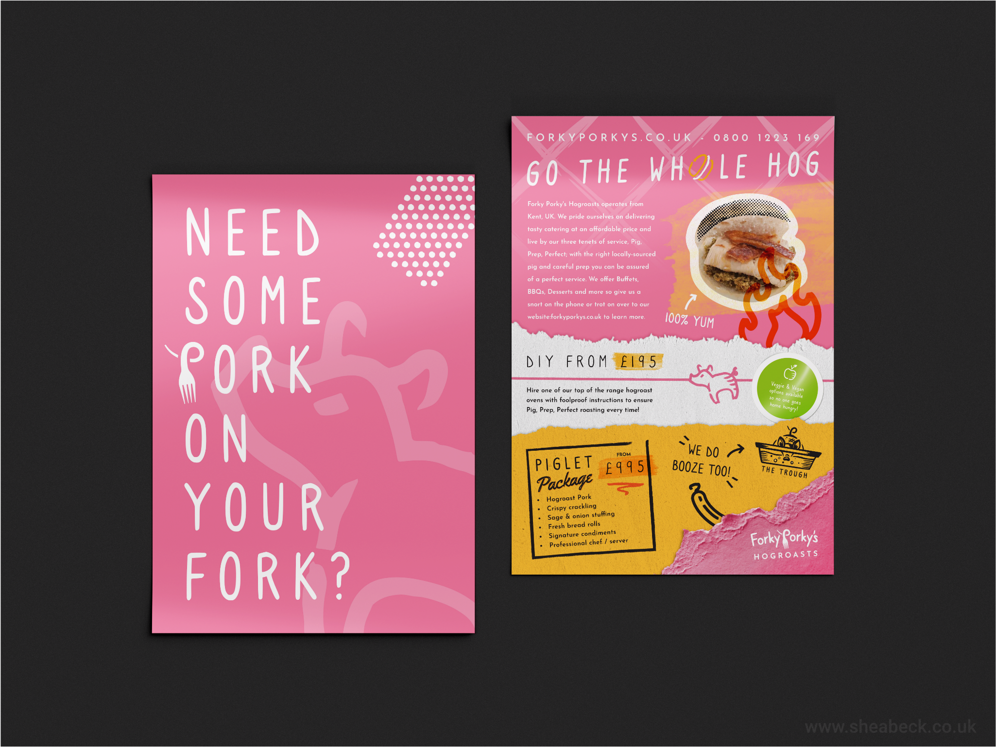
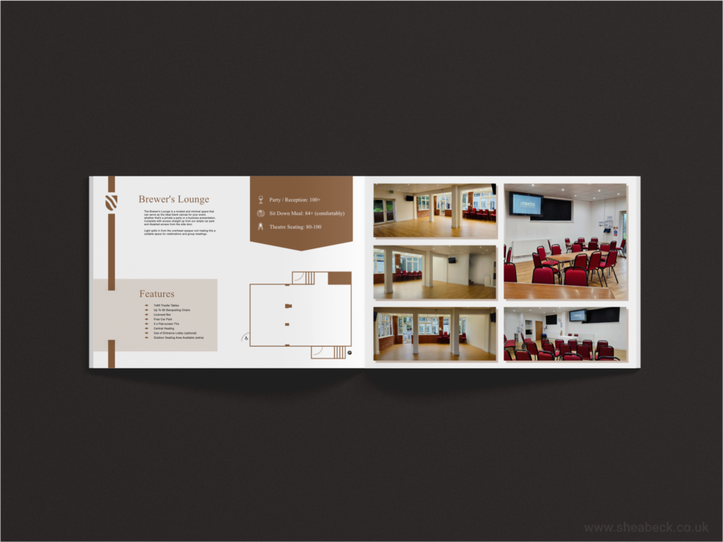
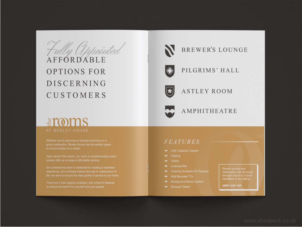
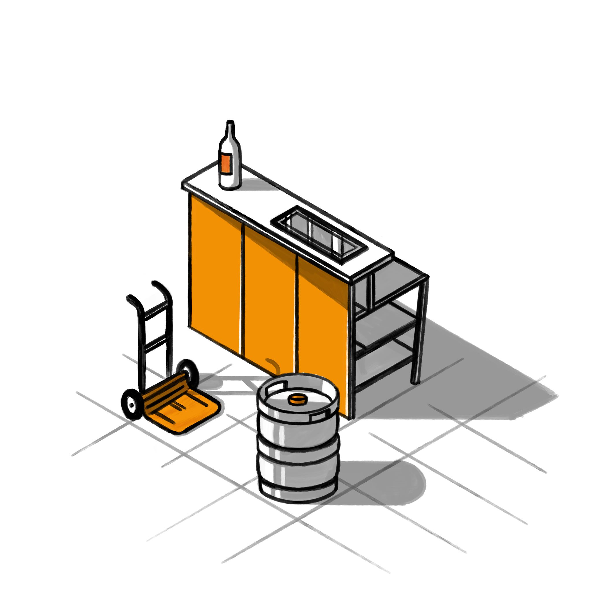
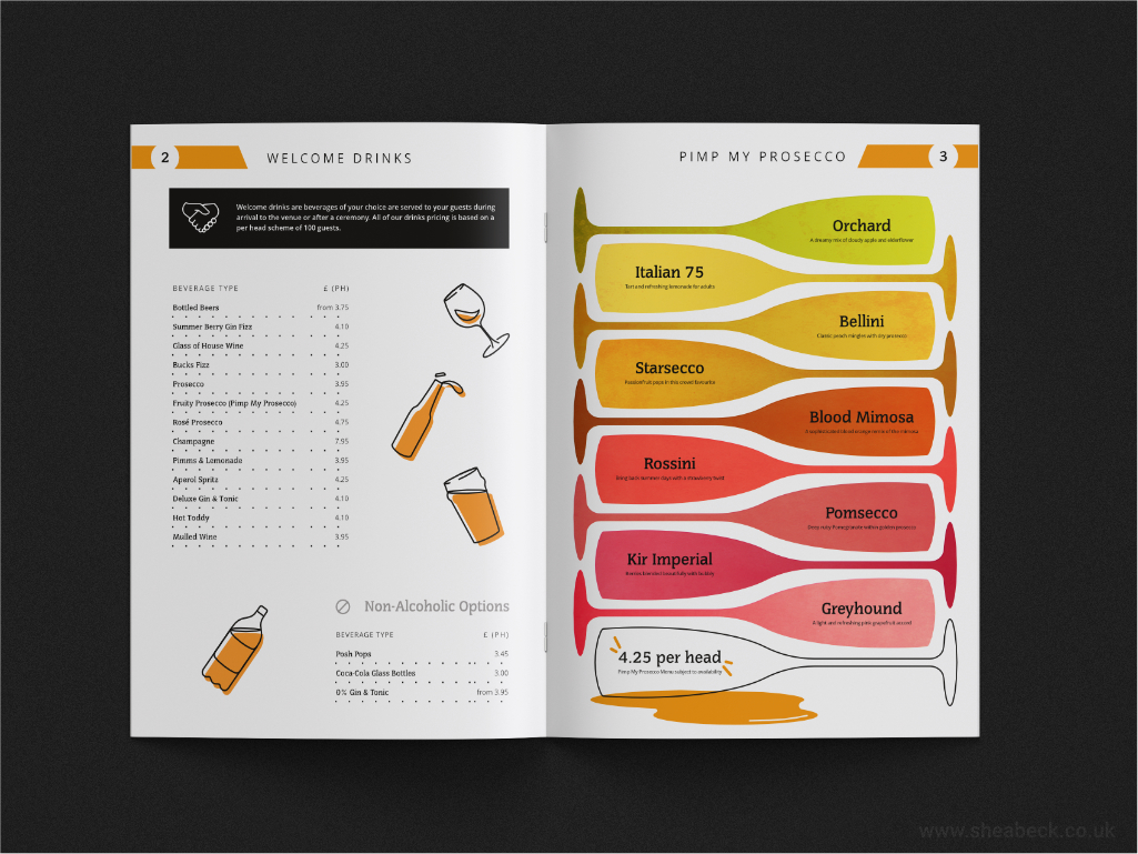
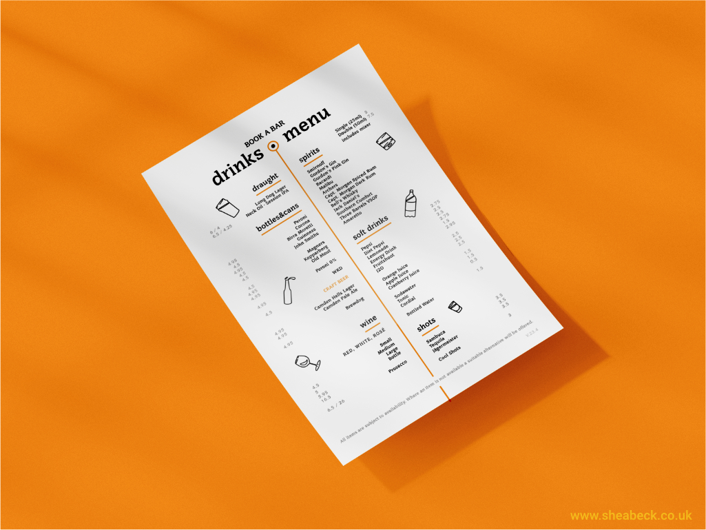
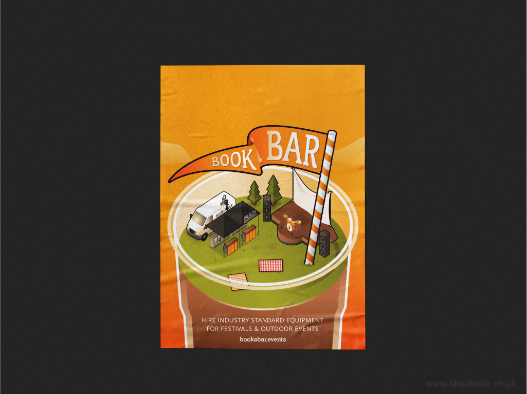
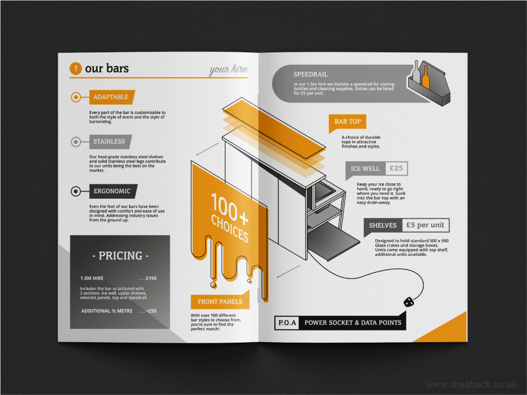
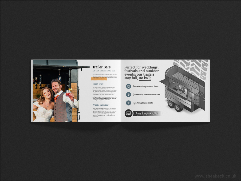
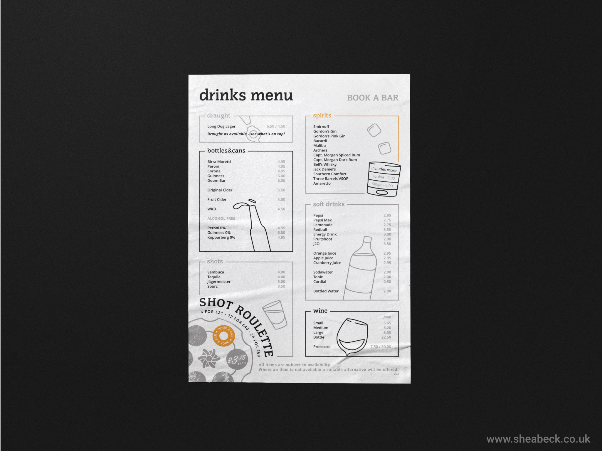
    4. Designing any physical media that needed reprinting in accordance with the new brand standards. This included the point of sale on mobile bar units, bar runners, menus and signage.
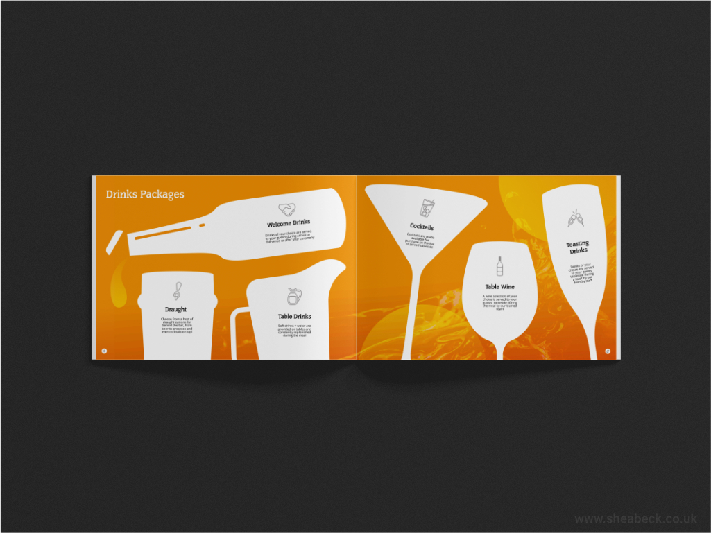
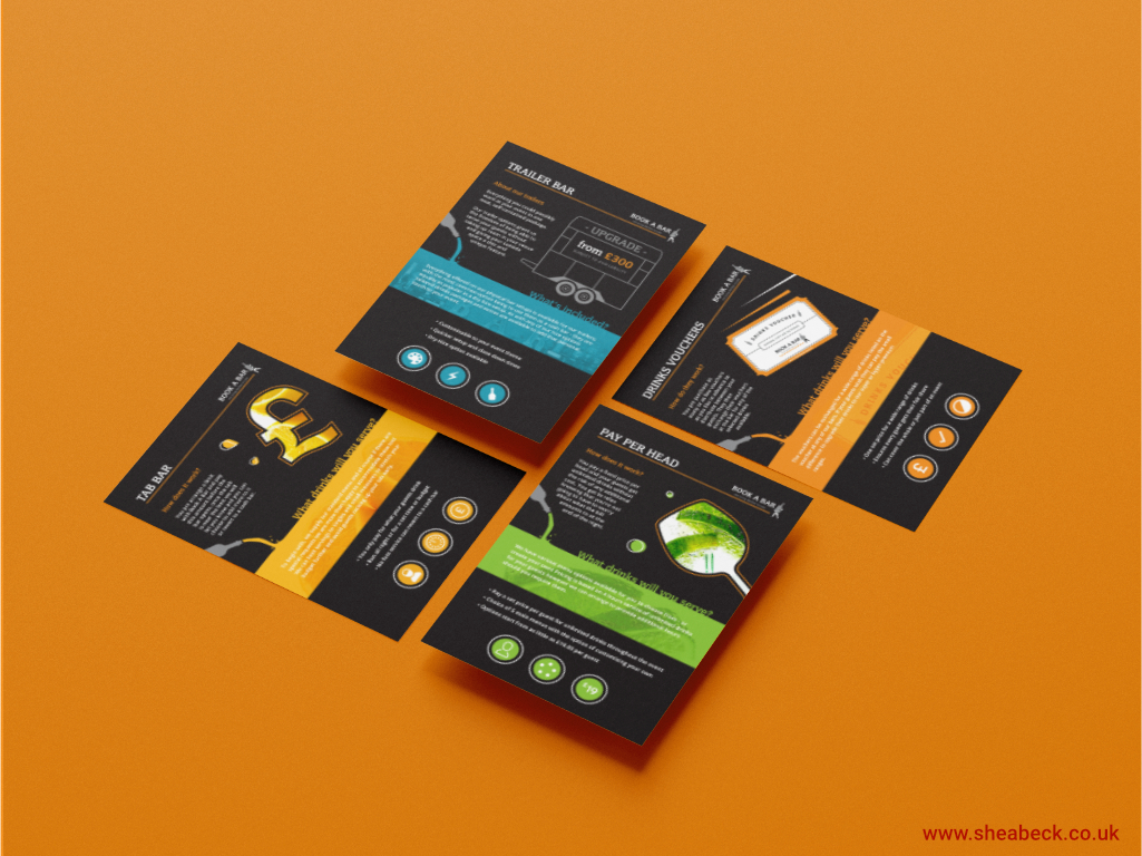
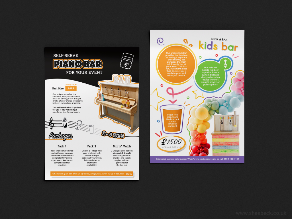
    5. Developing new promotional media that separated the core bar types and packages into a colour-based system that was easy to understand for new customers and the Team, highlighting the benefits of each type of service and allowing for simpler comparison during sales.
    6. Creating sub-identities for hired equipment that was entirely unique to Book A Bar and enabled them to better position these products to distinct audiences.

    Conclusion

    After the update to their brand identity, Book A Bar reported greater success with in-person meetings when utilising their fresh promotional material and they were more successful with upselling their lesser known services and products. Team morale improved as the contact and communication with lead nurturing had also benefitted from fewer instances of confusion. Customer feedback began to mention how well presented the bar media appeared with a general uptake in positive comments surrounding the customer’s journey and the company’s overall approach. At the time of writing this in July 2025, Book A Bar has remained a client of mine for the past 4 years. Together, we’ve built countless documents, worked on illustrations for bar panels, sign written vehicles and created one-of-a-kind POS display media for individual events. The continued evolution of their brand identity has been so successful in part to the initial groundwork we put in 4 years ago to re-establish their strategy and the diligent manner in which its director, Byron, has championed the company’s brand standards through to today.

  • Forky Porkys

    Forky Porkys

    Forky Porky’s is a catering company based in Rainham, Kent, UK. Their specialties include hogroasts and spitroasts, serving a a range of domestic and commercial events with a focus on affordable, traditionally cooked fare with a modern edge.


    Brand Analysis

    Forky’s owner had experience running a successful hogroast outlet years beforehand; stopping to travel the world and engage with other business ideas. The gentleman had kept the hogroast equipment for all of that time with the main trailer and roasting ovens laying dormant, ready to be dusted off and revived once more.

    From our initial talks regarding a logo, I had become intrigued in the vision for the brand and its development into a fully fledged business. I was shown past material and menus and it was clear that the catering market had moved on considerably since the initial venture had been shut down, what had worked before would not work again the second time around.

    The challenge ahead of Forkys was the following – how was it going to stand out on the market against a backdrop of fast food chains, local restaurants offering burgers, pulled pork and roasts, gastropubs and delivery-based dark kitchens? We sat down with our napkins and began brainstorming.

    No brief existed for Forkys at its inception and as a designer this is the equivalent of staring at a blinking cursor on a screen – you can take immense joy in having total freedom but the flipside is that designing with no brief can become an entirely overwhelming prospect. We took care with our initial market research as the data could better inform a direction.

    We noticed the following patterns from other hogroast companies across the UK:

    • Frequently male-owned, male target audience.
    • Old-world style that felt more spit and sawdust pub than pop-up pork.
    • Traditional Butcher Shop / English Racing Green colouring.
    • Drab menus that failed to get the tastebuds engaged or capture the eye.
    • Little accommodation for allergens and dietary requirements, businesses were missing the opportunity to include a wider catchment of diners.

    With the previous analysis in mind, we worked together to format an identity that stood as an antithesis to the ‘boring’ brands which had taken the market share. *We took the decision to push against the established look of other brands because Forky Porky’s was its own, fresh entity to the market and therefore had the opportunity to manifest curiosity and stand alone. My client was ready for a change in career and the operational decision to ‘go bold’ had low potential risks.

    *It’s worth noting here that, in larger businesses, such decisions can carry heavy penalties if a costly brand relaunch fails and so decisions are better informe d by further market analysis before proceeding with riskier strategies.


    Bold Brand Strategy

    Following the decision to ‘go bold’, we cherry-picked the traditional elements we liked and established the design language we would implement, namely; roundels and stamps that held a vintage feel to pay homage to the traditional side; informal hand-drawn iconography and illustration; bright colours that stood out and were food-adjacent in hue (no unnatural non-food colours); and finally, analogue textures such as paint and pencil for a homespun, handcrafted aesthetic.

    Typography and colours were addressed first, a rough and friendly condensed typeface allowed for easier display on future promotional assets and the body font contains certain irregularities which contribute to the informal nature whilst simultaneously staying legible and modern to suggest hygiene and competence. A shocking, fluorescent pink was chosen for the brand’s primary colour with ‘mustard’ yellow and ‘pepper grey’ as secondaries. The choice of pink was entirely necessary for Forky’s appeal to differentiate it from the crowd of greens and blues. The pink also served to benefit from a closer affinity with a female demographic as wedding catering bookings were a focus for my client and this colour pertained to pigs, pork products and playful brands.

    We applied the use of a signature ‘fork’ element as a cornerstone of the iconography symbolising food, mealtimes and catering at large. Together, we created menus and promotional media before tackling the larger, physical touchpoints which would enable the company to be marketed at long distances – a bright event gazebo with multiple panels and the trailer used to transport the ovens and equipment to and from sites.

    It was from experimenting with panel designs that an unexpected side of the brand revealed itself to us, we could make the brand more daring and expand its use of playful elements to endear people towards the assets and the pig characters inside its iconography. This altered our perception and assisted us in writing copy and forming a flavour for the brand which was lacking in that of its competitors.

    From the attached material you can witness the development of materials for Forkys and how the media shares the same cohesion across the many platforms that the identity engages with. The direct statements and pun-inspired copy spark curiosity and amusement, further establishing an effect that is approachable and trustworthy. The use of block backgrounds, outlined boxes and a recurrent colour theme allow menus and package deals to be stay navigable for comparing menu items and packages. Texture (such as grill marks, spilled condiments or handwriting) is used to pull the media into a catering setting and enhance the connection of the customer with sentiment towards favourite food, recipes and family meals.


    Result

    Upon finalising the project, Forky’s owner reported success in new bookings and on receiving tonnes of positive feedback regarding the punchiness and effect of the new identity. He mentioned that, in comparison to his past brand and its contemporaries, Forkys had a truly distinctive proposition and he couldn’t be happier with the way it grabbed attention at events and out on the road. Our attention to detail early on in the process and an unwillingness to compromise on smart finish es / investment into printing had paid off in full.

  • Boxley House

    Boxley House

    For further context to the following Case Study; Boxley House as an entity is no longer operational due to the closure of the physical site in late 2024. I showcase the nature of its development due to its fleeting success away from circumstances outside of my client’s control and I believe it to be a neat example of how brand identity can be implemented to diversify a space.


    Brand Analysis

    Following a networking social in late 2023, I was approached by a venue management company regarding an upcoming project to launch an identity for a school site that was looking to diversify its offering out of term-time. The company had a proposal in place to manage the ‘events’ side on behalf of the school and the building’s future promotion was to be advertised discreetly, so as to differentiate the interests of the school and its students away from this new events venture.

    There were several factors involved, including their on-site boarding students and administrative permissions that made it crucial for the new brand to possess a low-profile standing.

    As the sole creative on their small team, I had been invited to visit the site with the venue management company and join their assessment for how they would install wayfaring signage and split the venue spaces into distinct areas. Up until this point no identity had been set in stone, it was simply ‘the school that wanted to become a venue’ and so it remained nameless before the scope had been established.

    After the meeting, we reconvened and set out the key targets to consider for the identity;

    • Must appeal to the wedding market, prospective bride/grooms and wedding planners.
    • Branding should stand alone from the school and be distinct in its appeal.
    • Contain separate sections & recognisable ‘zones’ that are appropriate to the venue in order to cordon off areas and manage expectations for the hire.
    • External buildings to be marketed as ‘smaller hire spaces’ and marked accordingly.
    • Create a traditional ‘stately home’ impression to match the 17th Century core of the building.

    Back To School

    From the targets above, I began researching the area of Boxley (Boxley Village, Kent) and the surrounding foothills, immersing myself in historical data and material that referenced the ‘original’ house on the site. I found many gaps in the modern records for the house itself which in the last century had changed hands and registered purposes, lost acreage and benefitted from pre-fab extensions.

    On reviewing the book “The History of Boxley Parish”, by John Cave-Browne I discovered a direct reference to the building:

    “Thus the land above the Church was formed into a separate property, and became known as the Boxley House estate.”

    John Cave-Browne – “The History of Boxley Parish”

    I was overjoyed at this discovery as this gave provenance to the history of the house that had since been overlooked and pushed aside. On suggesting this direction to the team, we agreed that to restore its namesake as closely as possible to its prior prestige made the most sense in sharing the property’s story with prospective hirers. Within that same book I had also discovered the coats of arms of families that had inhabited Boxley – these served as pertinent inspiration for our ‘zoning problem’ and allowed me to create real iconography out of these crests that stayed relevant to the house’s history.

    A top priority during the branding project was to clearly communicate each area’s amenities to accurately market what potential clients could expect. Boxley House was split into the following sections:

    • Boxley House – for hire of the main house: its atrium and private rooms)
    • theRooms at Boxley House – covering 4 event rooms that stood annexed on the main site – these spaces were given the aforementioned crest identities.
    • Boxley Grounds – for any and all hires that pertained to use of the outdoor spaces.

    It is not uncommon for a large site to contain sub-identities and, before proceeding, I took care to prepare my client for the management of each and how the team’s external media would communicate this to customers. The danger of sub-identities is pulling focus away from the central identity and in order to mitigate this issue the typefaces and shape language we prepared matched the core ‘Boxley House’ look and feel.

    To create a cohesive voice, Boxley House had new wayfaring and signage media designed. The majority of the media created for Boxley’s event side was quick to install on event days where necessary and easy to uninstall at night when the event space needed to be turned back to the school faculty the following day.

    Outcome

    Boxley House was, unfortunately, not fated to last forever. The school ceased to continue partnership with my client due to the dissolution of the school site leading to the private sale of the site in 2024; however, in the short period of time I was involved with the identity of Boxley House the venue team had successfully found prospective hirers and completed; 3 Events in ‘Boxley House’, 9 Events in ‘theRooms At Boxley’ and 1 Event in ‘Boxley Grounds’.

    My client maintains that this was a great result from a limited tenure with the venue and remarked that, should it have been allowed to continue, this setup would have flourished under our commitment and development of the site’s branding. At the time of writing (July 2025) Boxley House is still listed for sale.